Saturday, July 26, 2008

funny cow


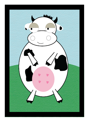
This is my little cow which is created in Illustrator. I had spent 3 hours in the morning to draw the cow and the background for it. There were a farm, a little house, fence, mountains, clouds and a lovely sun wearing sun classes. Then, when i was drawing the cow's ears, illustrator stopped working and it closed automatically :(( :(( :(( => illustrator is so mad :(( :(( :((

After the accident, i drew another picture but this time, i was so lazy, so i just drew a funny cow like that with out the lovely background that it used to have :((

However, my cow is still lovely, isn't it? I will try to draw another picture that with a beautiful background when i have free time ^^

OH MY GOD! MY COW IS SO FUNNY :XXX

Friday, July 25, 2008

LAYOUT


Oh, i am very happy now 'cause finally i could post this pic on my blog. I highly recommend you guys converting your images to the png file rather than jpeg in other to upload your images on the blogs. The colors of your pictures will not be changed if you do so. I have experienced it. When i posted my jpeg picture, the blog turned my work into blue. It's awful instead!

This is the layout that i did. I personally prefer the scrips fonts but we have learnt in class that we can not use these fonts for more than three lines. Then, i had to change my font into serif font. Now, it is not as elegant as my old work. However, readers could find it is quite easy to read the text in the serif font rather than scrip font.

To tell you guys the truth, i love design the layout very very much. I love arranging things. I dream to become an interior designer all the time but Multimedia Design is not so bad, isn't it? keke ^^

Oh, last thing, i found a lot of interesting and useful books in the library about layout such as "LAYOUT workbook", "GRIDS-Creative Solutions for graphic designers" and "The layout look book"....Why dont you guys go to the library and borrow them. I highly recommend that! ^^

Tuesday, July 15, 2008

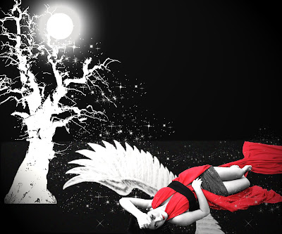
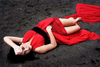
Moon Lady


I download the second picture from Deviantart and then, i used photoshop to add some effects to make the picture looks more interesting.
I really like "Brush" because it is a very convenient and interesting tool. As you can see, i used a lot of brush in the first picture. I also like using some light effects which made the picture looks real.

Hope u guys like it ^^

Monday, July 14, 2008

Cover


This is the cover that i made for a business plan.

Do you remember what our teacher said about design elements? Circle often bring us gentle and peaceful feelings as well as free movement, this is the reason why you can see a lot of circles in my cover. I'd like to give the readers a feeling of relaxation when they read the plan because the business is a stress reduction center ^^. In addition, there is a slogan for the company that i made up, "let your stress fly like balloons". As you can see, the words seem to be flying with all of the circles, right?

I love this cover very much, maybe because it is my product. How about you???

Saturday, July 12, 2008

teddy bear

I got this picture from my friend and when i asked her for the source, she did not remember. She wanted me to design this picture for her in order to use it as a theme in her yahoo blog!

and this is my work ^^
Which one do you prefer? Don't tell me the original one, guys :P

Wednesday, July 9, 2008

Pics


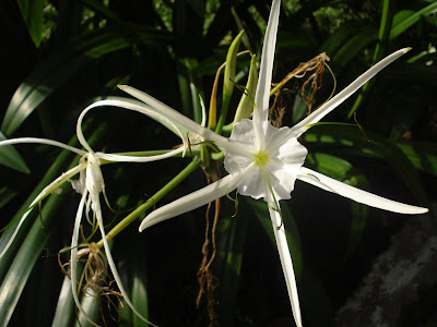
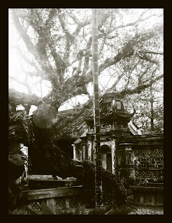
*I really love taking photos. These are my newest pictures taken in Tao Dan Park today! I used a normal camera, therefore, the quality of the pictures are not as good as i supposed them to be. :(( .However, they don't look so bad, right?

Let's enjoy, guys!!! ^^

Thursday, July 3, 2008

Old picture ^^


In this entry, i'm gonna post a tutorial to make a picture to look old like it was taken from more than 10 years ago :p
You may see and think that it's very simple to do that. However, i had to do quite a lot steps to finish the picture. I hope that this tutorial may help you to make a real old age pic ^^

* Follow these steps:

1. Duplicate layer

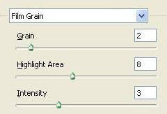
2. Filter => Artistic => Film Grain


3. Create a new layer, then fill color White to it.


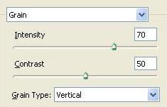
4. Filter => Texture => Grain


5. Blending 2 layers to Multiply mode, reduce the opacity to 50%

6. Create an other layer, fill color White to it, choose the Forecolour and Backcolour as black and white in turn.

7. Filter => Render => Clouds

8. Blending 3 layers to Multiply mode, reduce the opacity to 30%

9. Image => Mode => Grayscale.

You will see this box, click on "Don't flatten"


* Our image now is in black and white colour

10. Image => Mode => Duotone
Then, choose the colors that you like ^^

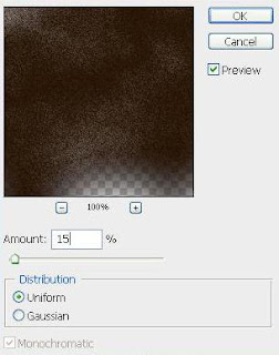
11. Choose Layer2, Filter => Noise => Add noise


------------------------------------------End-------------------------------------------------
*The picture that i used in this entry taken by myself when i was on my holiday a few months ago.

Money Rain :p


This is the picture that i took for my sister in Phu My Hung.


This is the picture that i used as my background! I download this pic from "wallcoo.com"


My sister is working in a bank at the moment. Therefore, she always dreams of becoming a "millionaire".
Then, i got an idea to make something funny for her! Just to pretend that her dream coming true ^^

I just used some some simple tips that i have learned in class during the first 2 weeks and something that my friend taught me! I think that all of you may know what tools that i used in Photoshop to create this picture, so that i wouldn't repeat it!


Now, please take a look at my work! ^^